Silicon Valley design guru John Maeda distinguishes between three categories: “classical” designers, who create physical objects or products; “commercial” designers who innovate by seeking deep insights into how customers interact with products and services; and “computational” designers, who use programming skills and data to satisfy millions or even billions of users instantaneously.
—Clay Chandler on the Design in Tech Report
SXSW 2026: UX to AX
If you have a personal Anthropic or OpenAI key, you can try out the apps I made for the report. Your key isn’t stored in local storage by default, but in general you should “clear” it after you’re done. Be secure! —JM

SXSW Session
Design in Tech Report 2026:
From UX to AX
Mar 18, 2026
11:30am – 12:30pm CT
Austin Marriot Downtown
Waller Ballroom C
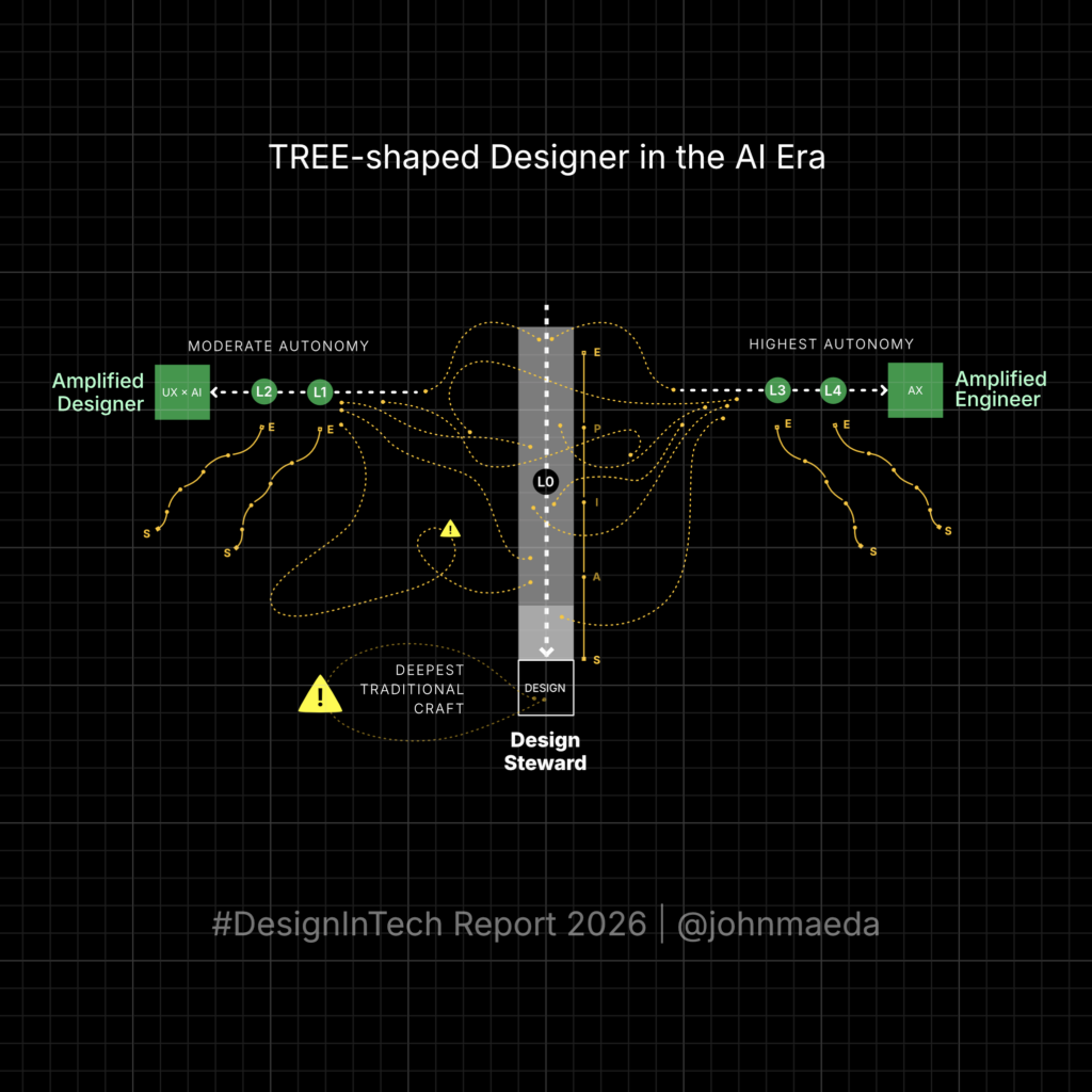
The Tree-Shaped Designer
It started with re-thinking the T-shaped designer …
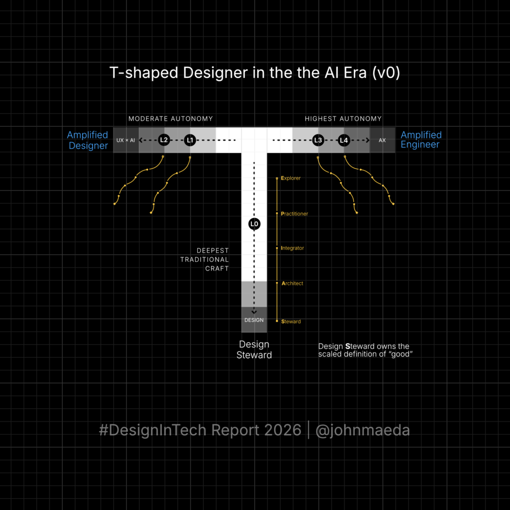
But it made sense to think of a “Tree”-shaped designer instead.
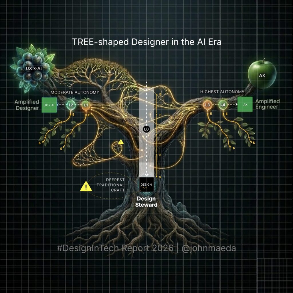
It’s easier understood in simplest form:
CURIOUS WHERE YOU STAND ON AI MATURITY?
Take Noah’s assessment
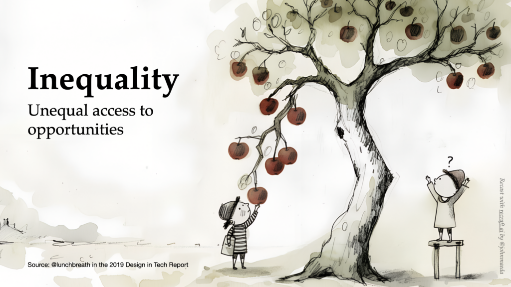
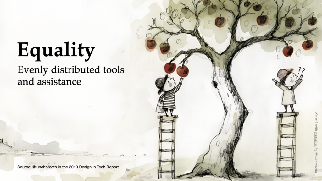
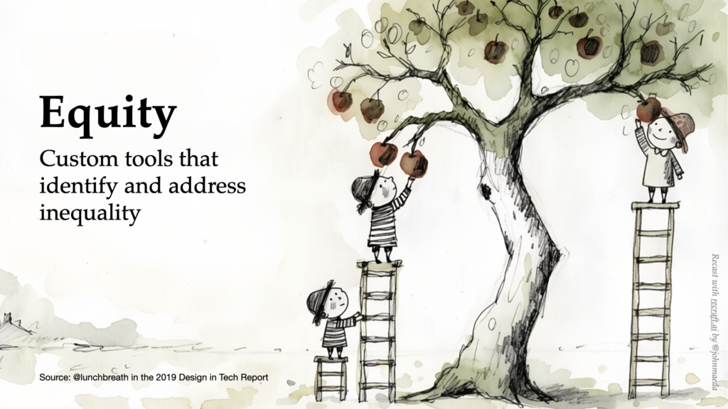
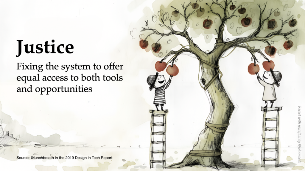
Inequality, Equality, Equity, Justice Series by Tony Ruth
I commissioned these in 2019 and had to take them off of the internet due to an artist’s claim. These versions don’t have that restriction. I made crafted them on recraft.ai with its very designer-friendly image generation models (disclosure: I am an investor).